
How Colour Psychology Transforms Your Home
When people think about renovating or designing a home, colour is often treated as one of the final decisions — a paint selection, tile choice, or styling selections.
But in reality, colour influences how a home feels long before furniture is installed.
A well-designed home is not just visually appealing — it supports the way you want to live. The colours you choose can shape mood, influence energy, change the perception of space, and ultimately affect how you experience your home day to day.
At Tandem Projects, we believe good design goes beyond trends. It’s about creating homes that feel considered, functional, and tailored to the people living in them.
Designing for Feeling, Not Just Appearance
Every colour creates a different response. The key isn’t choosing the “right” colour — it’s choosing colours that align with how you want each space to function.
Blue: Calm, Retreat, Reset
Soft blues naturally create a sense of calm and quiet, making them ideal for spaces designed for slowing down.
Best suited to: Bedrooms, bathrooms, and retreat spaces.
Rather than overly cool tones, softer layered blues paired with natural textures can create warmth without sacrificing serenity.
Green: Bringing Balance Indoors
Green continues to be a favourite for good reason. Inspired by nature, it introduces a sense of balance and ease while still feeling sophisticated.
Best suited to: Living spaces, studies, and transitional zones.
Muted greens like sage and olive work particularly well in homes where connection between indoors and outdoors is a priority.
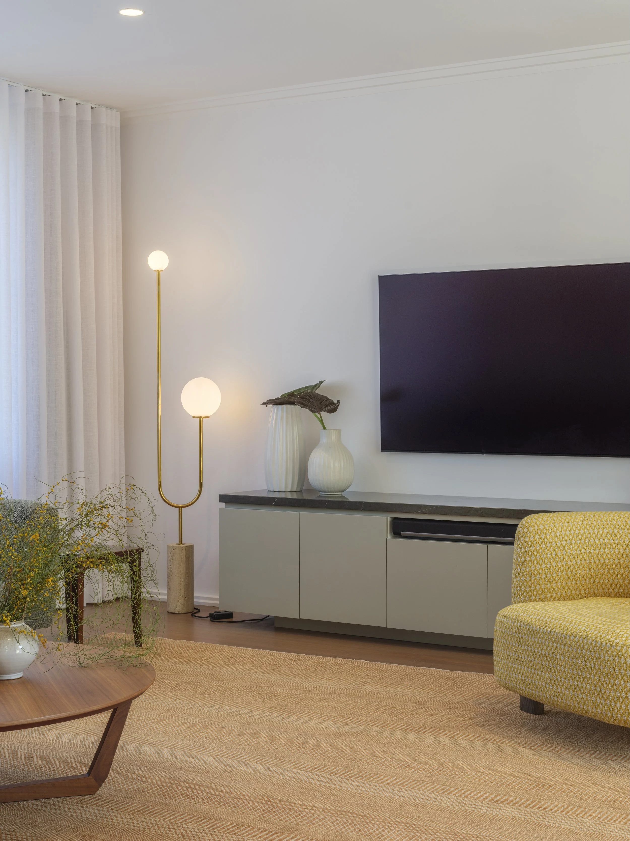
Warm Tones: Creating Spaces That Bring People Together
Warm neutrals, earthy terracottas, and softened yellows naturally encourage connection and comfort.
Best suited to: Kitchens, dining areas, and entertaining spaces.
These tones work particularly well in homes designed around gathering — helping create spaces that feel welcoming without becoming overwhelming.
Deep Tones: Creating Depth and Character
Charcoal, deep greens, and rich natural tones can transform a room when used intentionally.
Best suited to: Feature joinery, powder rooms, studies, or layered living spaces.
Used well, darker colours add contrast, definition, and a sense of architectural depth.
Neutrals: The Foundation of Longevity
Neutrals remain timeless because they allow materials, texture, and natural light to take centre stage.
Best suited to: Open-plan living and spaces designed to evolve over time.
The secret isn’t choosing white — it’s selecting undertones that complement flooring, joinery, and how light moves through the home.
Colour Can Change How a Space Feels
Colour doesn’t just affect mood — it changes perception.
Lighter tones can open up smaller rooms and maximise natural light.
Darker palettes can make larger spaces feel more intimate and grounded.
This becomes especially important in renovation projects, where colour often works alongside layout, material selection, and lighting to completely shift how a home is experienced — without changing the footprint.
Why Lighting Matters More Than the Paint Sample
One of the biggest mistakes homeowners make is choosing colour in isolation.
Natural light, orientation, finishes, and surrounding materials all impact how colour appears once installed.
A warm neutral in one room can read completely differently elsewhere.
That’s why we always encourage clients to view selections within the context of the broader home — because good decisions happen when design and execution work together.
A Well-Designed Home Should Feel As Good As It Looks
The most successful homes aren’t designed around trends.
They’re designed around lifestyle.
Colour is one of the most powerful tools in shaping that experience — helping create homes that feel calm, connected, inviting, or energising depending on how you live.
Because great homes aren’t built from individual selections. They come from thoughtful decisions working together to create spaces that truly feel like home.
Thinking about renovating? Thoughtful design decisions early in the process make all the difference later — and colour is only one part of getting it right.
Gladesville//